
For over a decade, the State of DevOps (DORA) report has guided software engineering leaders. It provided us with a shared language—the “Four Keys”—and a clear, linear path to excellence. You were either Low, Medium, High, or Elite. The goal was simple: move to the right.
But the 2025 DORA report has evolved from that linear progression. It introduces a fifth metric, grapples with the “AI Trust Paradox,” and moves away from performance tiers in favour of Seven Team Archetypes.
The report’s physical growth tells its own story. It has swelled from 31 pages in 2014 to a staggering 142 pages today. It is no longer a “report” so much as a socio-technical manifesto. This growth confirms what many have felt: DevOps isn’t just a CI/CD pipeline; it is the entire organisational culture. Beyond the classic metrics, the 2025 edition now tackles:
- AI Adoption: The Mirror and the Multiplier
- Platform Engineering: Improving Developer Experience (DevEx)
- Value Stream Management (VSM): Finding flow
- Competing Frameworks: How DORA overlaps with S.P.A.C.E and H.E.A.R.T
It is a celebration of how far we’ve come, but it also reveals a messy, nuanced reality that the old simplistic model can no longer capture. If you’ve felt like your “Elite” metrics weren’t telling the whole story of your team’s burnout or your product’s irrelevance, DORA 2025 finally agrees with you.
The 2025 Framing: From Performance to Archetypes
This year, DORA shifted not just what we measure, but how we group it. While the report includes industry analyses of AI Adoption, Value Stream Management, and Platform Engineering, this post focuses on the software delivery and the metrics that define it.
The Fifth Metric: Rework Rate
For years, we’ve relied on Change Failure Rate (CFR) to tell us if we were breaking things. But CFR is a lagging, “binary” metric—did it explode or not? The 2025 report promotes Rework Rate to the big leagues.
Rework Rate measures the effort spent fixing defects that users encountered. It’s the “hidden tax” of software delivery. A team can have a low CFR (they don’t “break” production often) but a massive Rework Rate (they spend 40% of their time fixing “almost right” features).
The AI Productivity Mirage
In the era of AI adoption, this raises a critical tension. If AI-assisted coding increases throughput but also increases Rework, does that still yield a net gain? The 2025 report identifies an “AI Trust Paradox.” Developers feel faster, but 30% of them don’t trust the code they are shipping.
We must ask: Is our high velocity a sign of “Elite” performance, or are we simply using AI to generate technical debt at terminal velocity? If Rework Rate is climbing alongside Deployment Frequency, you aren’t getting faster; you’re just getting busier fixing your own mistakes.
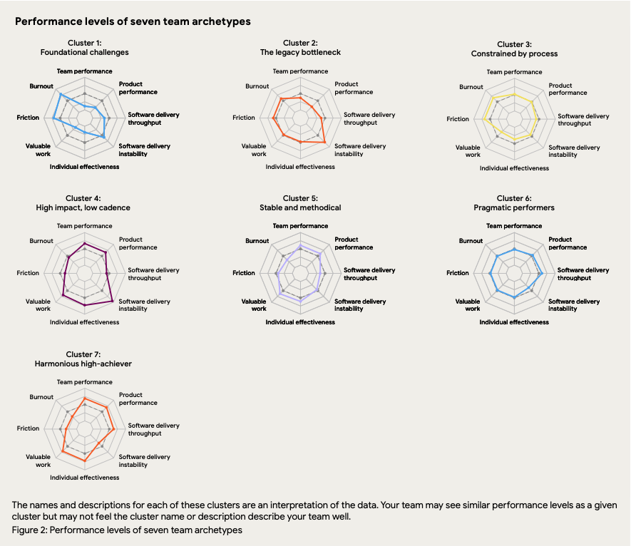
The Seven Archetypes: A Cluster Analysis
Gone are the “Elite” and “Low” labels. Instead, DORA uses cluster analysis to identify seven distinct profiles. This reveals a complex reality: a team can be fast (High Throughput) but miserable (High Burnout), or stable (High Reliability) but stagnant (Low Impact).
Every team makes trade-offs. The seven archetypes reveal exactly what price your team is paying—whether it’s burnout, irrelevance, or stagnation.:
- Harmonious High-Achiever: The “Flow State”, low tax, high dividend.
- Stable and Methodical: The “Safety Vest”. Safe, but know you could move faster.
- High Impact, Low Cadence: The “Adrenaline Trap”. Great results are fuelled by heroes who are burning out.
- Pragmatic Performer: The “Comfort Zone”. Balanced but not outstanding, with excellence drifting out of reach.
- Constrained by Process: The “Bureaucracy Trap”. You have stability, but only because red tape prevents you from moving fast enough to break anything.
- Legacy Bottleneck: The “Hamster Wheel”. High effort for low reward.
- Foundational Challenges: The “House of Cards”. Struggling across all dimensions, just trying to survive until Friday without the whole thing collapsing.
Why do these labels matter? Because you cannot treat a ‘Legacy Bottleneck’ with the same medicine you give a ‘Stable and Methodical’ team. One needs automation, the other needs courage.
Content Overload and Mixed Messages
Despite its value, the 2025 report suffers from a poor Signal-to-Noise Ratio. At 142 pages, the report fails to effectively communicate that archetypes augment—rather than replace—key metrics.
The report’s poor visual choices make the data even harder to interpret. Using radar charts (spider graphs) to represent the 7 Team Archetypes was arguably a mistake. Visually, radar charts suggest that neighbouring values connect in meaningful ways. This further means that the ordering of the axes is important. Finally, we assume, like in many charts, that bigger is better. When much of this is not true, the reader must decode the chart every time they see a new archetype. Choosing radar charts was a fascinating mistake for a report built on data clarity, as it forces the reader to treat ‘Burnout’ and ‘Throughput’ as visually equivalent area-fillers.
Below are the seven team archetypes and their performance levels across the eight axes:
- Team Performance,
- Product Performance,
- Throughput,
- Instability,
- Individual Effectiveness,
- Valuable Work,
- Friction, and
- Burnout
While the new team archetypes can steal focus, what can be missed is that the 5 Key Metrics are still the what; the key metrics to define your team’s software delivery performance. The new Team Archetypes is an attempt to expose the why: the causal factors and the interplay between delivery performance and the human experience that drives it.
Resolving the Visual Anti-Pattern: The Cognitive Dissonance of “More Area”
In a radar chart, our brains are hardwired to interpret “more area” as “more value” or “better.” But in the current DORA charts, some axes are “Good” (Deployment Frequency), and some are “Bad” (Burnout, Friction).
This creates a visual paradox. A “large” shape on the chart could represent a team that is doing amazing, or it could represent a team that is delivering fast while simultaneously burning its people into the ground.
The DORA reports charts suffer from a classic data visualisation anti-pattern: Mixed Polarity.
If we zoom in on the “Harmonious high-achiever” chart, we can see that low values for Burnout, Friction and Software Delivery Instability show a desirable narrowing. Contrast this with “Foundational Challenges,” which might appear to have a similar volume of area but represents a totally different (and worse) reality. This confusion is reinforced when a glance suggests that “High impact, low cadence” has the largest volume, so is this the highest-performing cluster?
The reader needs to mentally link certain areas with good and others with bad. We could add more visual clues to the chart to indicate where the areas we want to avoid are, such as below:
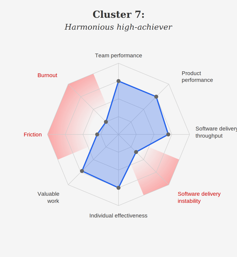
While this provides some visual guidance, it also adds clutter. When the report document is this large, it also needs to be highly consumable. This unnecessary mental burden makes the document harder to use.
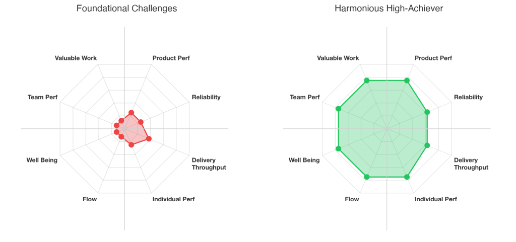
The Solution: Reframe the Visuals with Consistent Polarity
To make these archetypes useful, we must align the axes’ polarities. Every axis should target a “large number” for a “positive outcome.” This requires us to invert our thinking:
- Instability becomes Stability / Reliability
- Friction becomes Flow (Low Friction)
- Burnout becomes Sustainability / Well-being
When we do this, the “Elite” profile (the Harmonious High-Achiever) becomes a full, robust circle. A “Low” performer becomes a small, constricted dot. We move from a cognitively demanding “decoding task” to a high-bandwidth pattern-recognition task.
Visual Bias: The Compass of Engineering Health
Once the axes’ polarity is corrected, the shape of the radar chart tells a narrative story.
By rearranging the axes intentionally, we can create a North-East-West-South compass labelling system that categorises the engineering landscape into coherent areas on the chart.
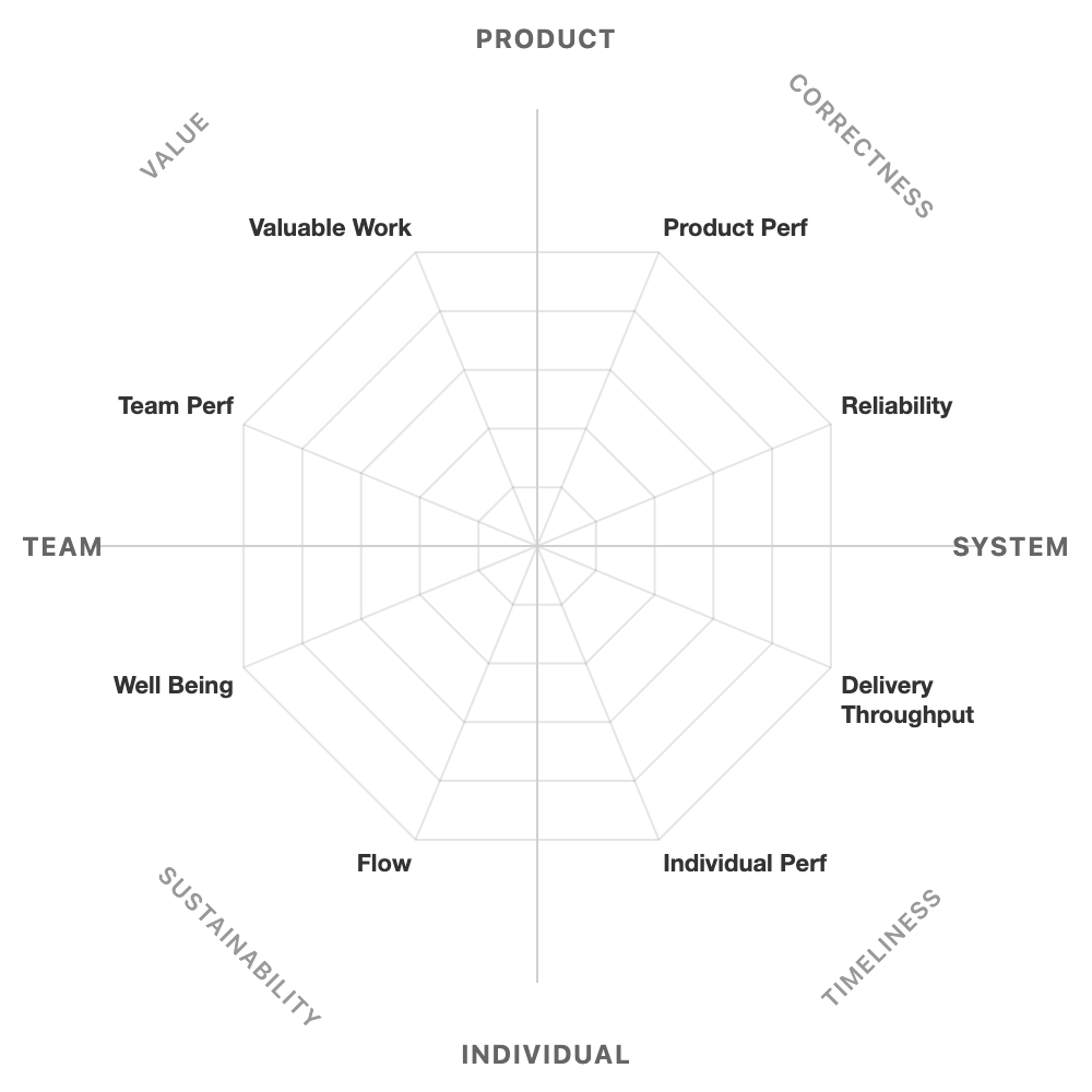
To demonstrate, we can compare two directions.
↖️ North-West: Value Focus
The North-West axes (Team Performance and Valuable Work) answer the question: Are we aligned on what matters?
This is the quadrant that teams romanticise. Strong North-West performance means shared purpose and effective collaboration. The team understands why their work matters. Standups facilitate coordination and common understanding. Strategy isn’t something that happens to them; they helped shape it.
But North-West has a shadow side: Strategy Theatre. The team excels at articulating vision. They run excellent planning workshops. Their OKRs are crisp and cascading. And yet—delivery stalls. Pursuing consensus becomes a reason to delay action. “We need another stakeholder review” replaces “Let’s ship and learn.”
The warning sign: the team’s slide decks are better than their shipped code.
↘️ South-East: Timeliness Focus
The South-East axes (Delivery Throughput and Individual Performance) answer the question: Are we building it fast?
Strong South-East performance means work flows efficiently from commit to production. Individuals are productive. Cycle times are short. The team moves.
This is the quadrant teams slide into without noticing. Under deadline pressure, South-East feels like success: tickets close, PRs merge, velocity charts climb. But unchecked, South-East becomes the Delivery Factory: tickets in, tickets out. Speed and individual throughput are maximised at the cost of stability, collaboration, and building the right thing. The team becomes a feature assembly line, disconnected from outcomes.
The warning sign: everyone is busy, but nobody can explain what problem they solved this month.
The complete compass model appears in the appendix, useful for teams conducting self-assessments or presenting to leadership. They provide guidance on managing dips and spikes. It helps reveal the classic tensions between Product & System (North vs. East) or Sustainability vs. Timeliness (South-West vs. South-East).
Navigating the Archetypes with a Compass
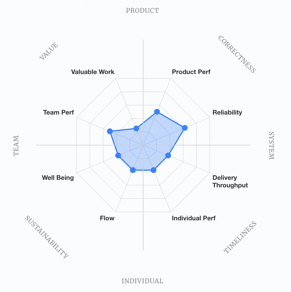
The Legacy Bottleneck (“Effort Mistaken as Impact”)
The Legacy Bottleneck chart shows a small area with a distinctive spike towards Individual Performance and Valuable Work. The team fights against systemic constraints to achieve delivery. They may be mistaking their heroic efforts for valuable work, but they may be working harder, not smarter. If they fail to invest elsewhere, the team will continue to struggle.

Constrained by Process (The “Reliability-Spike”)
The Constrained by Process chart also shows a small surface area, but with a spike towards reliability and a dip in perceived value of the work. The team maintains system stability despite other challenges. Process overhead preserves stability but limits throughput and engagement. This is the “Safety-First” silo. As per the Legacy-Bottleneck, if they continue to invest poorly, they will keep struggling.
High Impact, Low Cadence (The “Critical Imbalance”)
Characterised by its distinctive dip, the High Impact, Low Cadence chart represents teams that produce high-impact work but suffer from volatile delivery models. This pronounced imbalance reveals teams delivering high-impact work through heroic effort rather than sustainable systems. This may be affecting the team’s sustainability. Strong performance in some areas indicates the team have earned the right to start investing in their weak areas. In this case, focusing on the eastern “System” axes of Reliability and Delivery Throughput could justify investment in SRE and Platform Engineering practices.
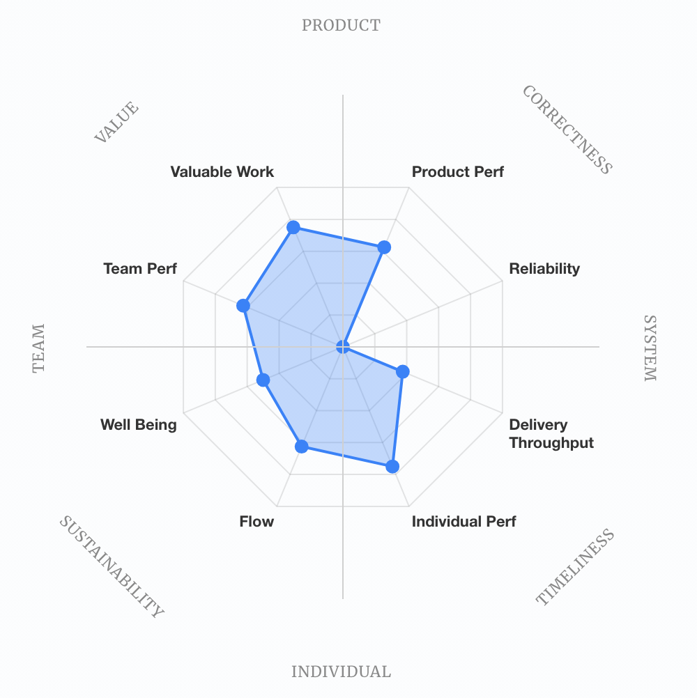
It is now very clear that the “High Impact, Low Cadence” archetype is not the strongest performer.
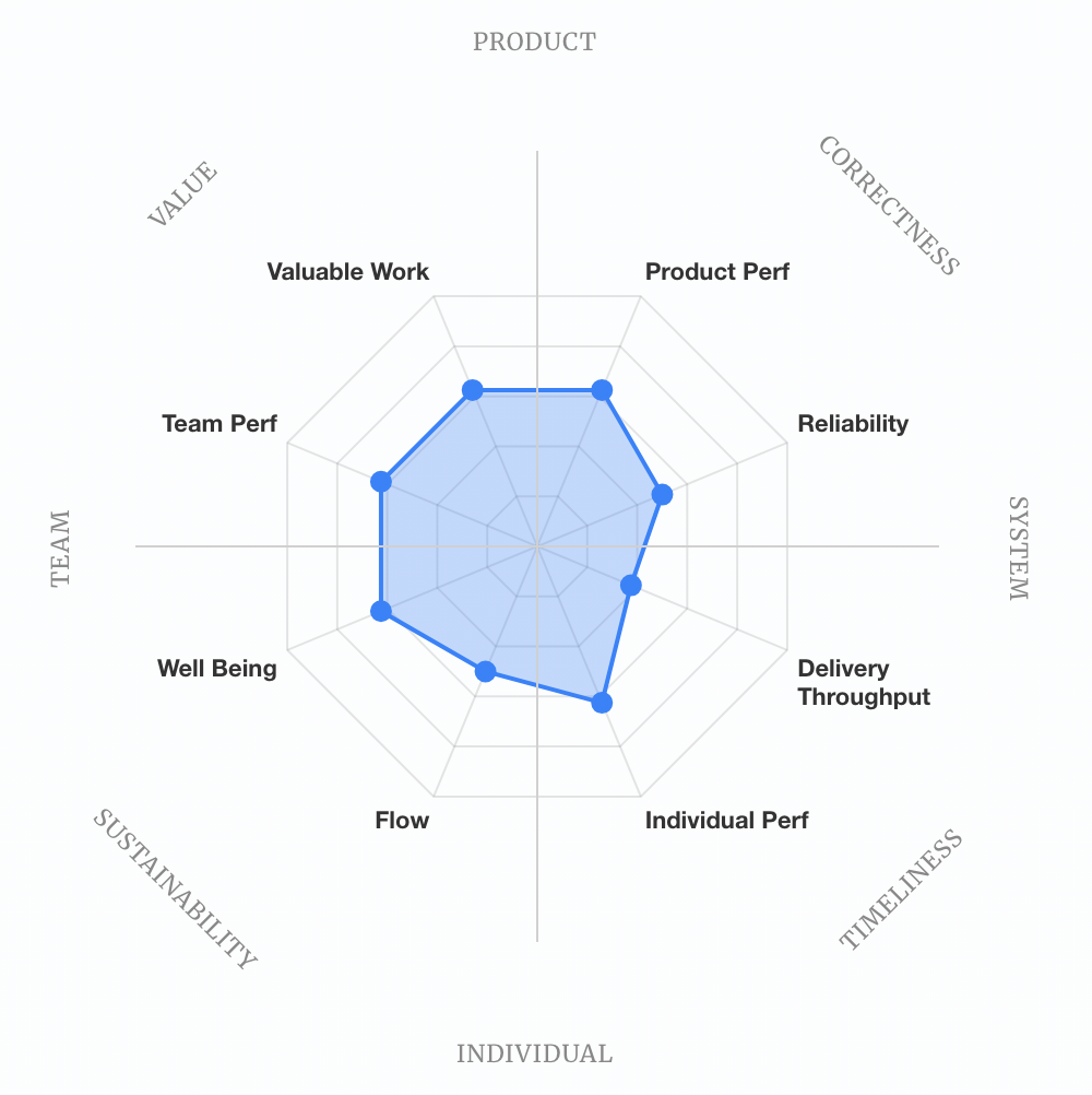
Stable and Methodical (The “Small Dip”)
The small dip in the Stable and Methodical chart shows good health except for delivery throughput. A well-functioning team that has chosen—or been constrained to—a deliberate, methodical pace that prioritises quality over speed. This indicates that the team have earned the right to invest in improving their delivery throughput. Applying Error Budgets based on SLOs and SLIs, with the assistance of an SRE, could help unlock the team’s possibly overly cautious approach to delivery. After adjusting the visuals, it is clearer to see that this is the second-highest-performing archetype.
Pragmatic Performers (The “Balanced Growth”)
The Pragmatic Performers show balance in most areas. While performance is balanced, it is only low-to-moderate; the team is not strong in any factor. Consistent adequacy may be mistaken for strong or even excellent performance. There is plenty of room for improvement across the board.
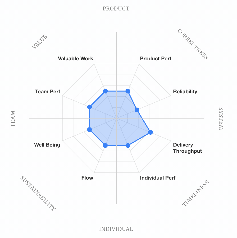
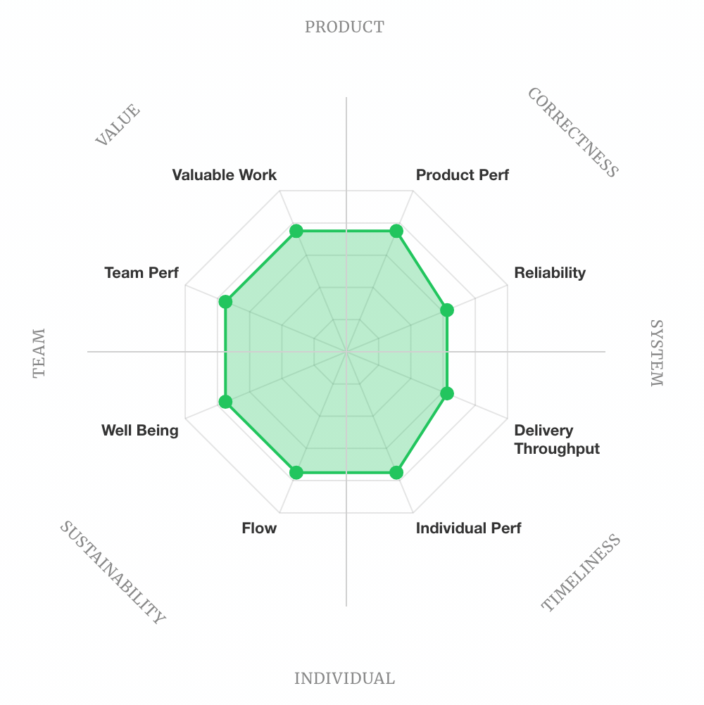
Harmonious High-Achiever (The “Full Circle”)
The goal. They have filled out the circle. They build the right thing (North), build it right (East), build it sustainably (South), and build it on time (West). They have achieved a balance of performance across the board. There is still room for improvement (there always is), but the team have earned the right to choose their focus for improvement.
Framing Your Team
The Five Key Metrics are still your guiding metrics. Your Team Archetype provides a tool to identify specific areas that contribute to or affect the Five Key Metrics. The Seven Archetypes are a gift to the industry because they offer comfort in knowing you are not alone; there are other teams in a similar situation. The compass model proposed here elevates from providing comfort to providing targeted interventions. You don’t give the same advice to a “Legacy Bottleneck” team as you do to a “Stable and Methodical” team. One might benefit from a platform; the other might benefit from automating quality checks to push for velocity. The compass model offers a more flexible framework that supports teams that do not identify with any of the 7 official archetypes.
Use your Team Archetype as a diagnostic tool to identify why your metrics look the way they do.
The Compass Model allows for targeted interventions:
- The Legacy Bottleneck are the victim of a “Spike”. Further investment in where they are performing well won’t help. It is constrained by all other areas. Start by incrementally improving all areas to increase the “circle”. e.g. Don’t tell them to “work harder”, instead aim to reduce rework and instability.
- The High Impact, Low Cadence team is the victim of an imbalance. Continue celebrating where the team is a strong performer, but avoid overinvesting here. Neglecting the ‘System’ will eventually impact the ‘Team’ and ‘Product’. Give them CI/CD automation, quality System Observability and a formalised Incident Response program to reduce the heroism required to ship.
- The Stable and Methodical team have only one weakness, so focus on that. In this case, challenge them to increase their “Risk Budget” to drive higher throughput. Support it with metrics to track both goals and guardrails; delivery throughput and change failure rate.
Beyond the “Elite” Myth
Many “Elite” teams from previous years may now be able to reveal constraints to their long-term sustainability to maintain their elite status. While they may be getting strong scores in Lead Time, Deployment Frequency or Change Failure Rate, this may have come at the cost of metrics now exposed in the “Sustainability” and “Value” quadrants.
If you are “Elite” in Throughput but “Foundational” in Sustainability, you aren’t an elite team—you are a team on the verge of a talent exodus.
DevOps is a cultural philosophy, and by ignoring the human element (South and West), these teams may just be moving back towards “Ops” (East) and missing the broader benefits of fully embracing DevOps.
By proposing a consistent “Visual Language of Archetypes,” we move the conversation from “What is our score?” to “What is our shape?”
Conclusion
For a decade, DORA gave us a ladder: climb from Low to Elite. The 2025 report replaces the ladder with a compass. You are no longer asked how high, you are asked which direction. That shift matters. A ladder implies a single path. A compass acknowledges that a team drifting South-East needs a different intervention than one stuck in the North-West. The Five Key Metrics remain your coordinates; the archetypes reveal the terrain.
Rework Rate is the most consequential addition, not because it is new, but because it finally names the hidden tax that “Elite” teams have been paying in silence. Velocity without quality is not progress; it is just motion.
Plot your team’s shape this quarter. See where it leans. That’s not your score, it’s your starting point. Stop trying to be Elite. Start trying to be Harmonious.
Appendix
DORA 2025 Survey questions: https://dora.dev/research/2025/questions/
Compass model taxonomy
⬆️ North: Product Focus (Value & Impact)
- Axes: Valuable Work & Product Performance.
- Question: Are we building the right thing?
- Strength: A strong North indicates a team deeply connected to user needs. A strong Product focus ensures valuable work is mapped to high-impact features
- Bias: The “Feature Factory”. Relentless focus on shipping product outcomes without regard for technical sustainability or team health. Features are pumped out to hit metrics, but mounting technical debt and exhausted teams erode long-term capability
↗️ North-East: Correctness Focus (Impact & Reliability)
- Axes: Product Performance & Software Delivery Instability (inverted)
- Question: Are we building it correctly?
- Strength: A strong North-East indicate a team that delivers high-quality products on a stable foundation. Features work as intended, and the system behaves predictably under load.
- Bias: The “Quality Fortress“. Perfectionism masquerading as professionalism. Nothing ships until it’s bulletproof, leading to analysis paralysis, over-engineering, and gold-plating. The pursuit of correctness becomes a reason to avoid the risk of delivery.
➡️ East: System Focus (Reliability & Delivery Throughput)
- Axes: Software Delivery Instability (inverted) & Delivery Throughput.
- Question: Are we building it right?
- Strength: A strong East indicates a highly stable, regularly updated system. It can achieve that challenging balance between throughput and stability.
- Bias: The “Process Cathedral“. Infrastructure and tooling become ends in themselves. The team builds elegant pipelines, sophisticated observability, and pristine environments—but loses sight of whether any of it delivers actual user value or causes undue conflict and burnout. Ops may have trumped DevOps.
↘️ South-East: Timeliness Focus (Speed & Efficiency)
- Axes: Software Delivery Throughput & Individual Performance
- Question: Are we building it fast?
- Strength: A strong South-East indicates a team that moves quickly with effective individuals. Work flows efficiently from commit to production, and developers are productive contributors.
- Bias: The “Delivery Factory“. Tickets in, tickets out. Speed and individual throughput are maximised, but at the cost of stability, collaboration, and building the right thing. The team becomes a feature assembly line disconnected from outcomes.
⬇️ South: Individual Focus (Individual Performance & Flow)
- Axes: Friction (inverted) & Individual Effectiveness.
- Question: Are the Developers and Engineers efficient?
- Strength: A strong South shape indicates the team’s members are free from excessive bureaucracy and have clear “maker time”. They have the tools and space to be in the flow.
- Bias: The “Hero Culture“. Individual contributors are optimised for personal performance and flow, creating silos and single points of failure. Knowledge hoarding, lone-wolf behaviours, and a dangerous bus factor emerge as collaboration atrophies.
↙️ South-West: Sustainable Delivery Focus (Flow & Wellbeing)
- Axes: Friction (inverted) & Wellbeing
- Question: Is delivery sustainable?
- Strength: A strong South-West indicates a team where individuals can work without friction or burnout. The pace is maintainable, and people have the headspace to do good work over the long term.
- Bias: The “Comfort Cruise“. Sustainability tips into stagnation. The team avoids stretch goals, resists change, and prioritises comfort over growth. Work feels pleasant but lacks challenge, and capability slowly erodes through disuse.
⬅️ West: Team Focus (Well Being & Team Performance)
- Axes: Burnout (inverted) & Team Performance.
- Question: Are we working as a team?
- Strength: A strong West shape indicates a team that works well together, can rely on each other, grow together and can adapt to change.
- Bias: The “Consensus Swamp“. Team harmony becomes sacred, and conflict is avoided at all costs. Endless collaboration, meetings about meetings, and groupthink replace decisive action. Everyone feels good, but nothing meaningful ships.
↖️ North-West: Value Focus (Purpose & Collaboration)
- Axes: Team Performance & Valuable Work
- Question: Are we aligned on what matters?
- Strength: A strong North-West indicates a team with shared purpose and strong collaboration. The team collectively understands why their work matters and coordinates effectively to deliver it.
- Bias: The “Strategy Theatre“. Grand visions and valuable-sounding initiatives proliferate, but execution never follows. The team excels at planning workshops and alignment sessions, while actual delivery stalls in pursuit of the perfect strategy.
